Sunday 28 September 2014

Contents Page 4

Step 4.


Like the other stage I decided to group together the stages I did. I started of by using the text tool box, I made a little box next to the first picture, I chose the font Iskoola Pota in size 30 pt, I chose this for all of my boxes, the colour was blue so it matched the title colour.

Contents Page 3

Step 3.

Instead of making the stages in to three separate ones I decided to group them all together. In this stage I needed to add photos to the contents page instead of having just writing, I chose images such as students in front of Hyde Clarendon Sixth Form getting their results, students eating and students working to show variety in what the college magazine can offer them. 

Thursday 25 September 2014

Contents Page 2

Step 2.
 This stage was by far the most fun, I went on to da fonts, after a while looking at all the different fonts available i settled on "Little Snorlax" in the fancy area,after downloading the font I went back onto my Photoshop page and used the text tool to make a box at the top of the page for the title, I then chose the font and wrote contents, after doing this the title still wasn't right so I selected it all and change free colour to a dark blue at the top of the page and then made the font sized 150 to and that was it. 

Contents Page 1

Step 1.
Starting of my contents page was pretty simple, I opened up Photoshop and opened a new page as "us paper". As this left me with just a plain white page, I wasn't sure on if I wanted it a block colour or not, I went on to layer, then new fill layer and played around in that area till I selected gradient fill. After selecting this i then chose my colour orange but I wasn't keen on how some bits turned out grey, I played around the arrows on the gradient effect and changed some to white and eventually got what I desired.

Contents Page Mock Up


This was a very quick sketch of what o want my contents page to look something like, I'm not sure on how I want my lay yet like the image above or different i will have to wait and see what I prefer.

Process Of The Magazine 10

Step10.


In the final step of the magazine I used the text tool again after making the box and typing the text I changed the second part of the writing to black and made it size 36 instead of the 49 it originally was like the rest of the text, I then highlighted the black text and right clicked it and selected italic.
I then finally decided to bring back the '99.9% pass rate' and simply moved it down a bit.

Process Of The Magazine 9

Step 9.

This step is the same as the one before but adding more text. I went on to the text tool and made a box at the bottom of the page. I typed what I wanted it to say and then I chose the same font 'Cen MT Condensed Extra Bold' and mad it size 41, to make it the same orange as the masthead I used the eye dropper tool after highlighting the text.

Process Of The Magazine 8

Step 8.

The next step was one of the easiest I first hid the other text '99.9% pass rate' as i was not sure whether I wanted to keep it, it is the filling out of the front cover, e.g adding the cover line. To do this I clicked the text tool and then made an average sized box to type in. After typing my desired text I then highlighted it and went on to 'create warped text' at the top of the screen, I chose to used 'squeeze' and then selected vertical. The text font I  chose to use was 'Tw Cen MT Condensed Extra Bold' I then made the font size 60pt. 

Sunday 21 September 2014

Process Of The Magazine 7

Step 7.

In this stage I simply added a bar code. To do this I found a image of a bar code on Google, saved it and then I went onto file, open and selected the bar code then I selected 'Show Transform Control' and made it a lot smaller than the original size then the rotated it and then I selected the the mouse control and moved it down to the right hand corner.

Process Of The Magazine 6

Step5.

In this stage of the magazine process, I added the cover line, I selected the text tool and made a little box and then after writing, I changed the font to 'Franklin Gothic Book'

Process Of The Magazine 5

Step 5.


On this stage I was, again, focusing on the 'Masthead' and I didn't like that it was covering her face. so I selected the text layer and then clicked on the rubber on the left side bar, I tried rubbing it out but couldn't see where I was going so I zoomed in using command + and the made my rubber a lot smaller to go round the edges.

Process Of The Magazine 4

Step 4.
In this step I focused on the text. I double clicked the text layer and this box popped up, I then proceeded to go through the styles on the left side and then chose 'Contour', 'Stroke' and 'Drop Shadow'. 

Process Of The Magazine 3

Step 3.

In this stage I added the 'Masthead'. I wasn't too keen on the fonts on Photoshop, so I went on "www.dafont.com" I went on to the 'Old School' after looking through most of them I settled on the 'Varsity' font. After downloading and installing it I could then select it on Photoshop. After that I wanted to change the colour of the text so I highlighted the text and went to the colour palette at the top of the screen and changed it to the orange colour.

Process Of The Magazine 2

Step 2.

After adding the picture I then add another layer for my next part of the front cover, the masthead.

Process Of The Magazine 1

Step One.


Firstly I added my desired picture to Photoshop, this image is a medium shot, as it shows from the waist up.

Saturday 20 September 2014

Magazine Mock Up Sketch


This may not be the best drawing, but before I did my magazine cover on Photoshop I did a quick drawing to show my process of how I wanted the magazine cover to come out. I will do the same for my contents page to show my process of that also.

Interview Analysis

Questions;

1. How would the magazine appeal to you, what colours and fonts would you like?
From this question I found that the most popular answer was that they wanted bright colours, such as pinks and purples, they wanted the colours to stand out. I also discovered that with the font side of the front cover people wanted fancy fonts but also easy to read.

2. Would you like the ins and outs of college gossip? 
This question got mixed messages as some said yes, they would but some only want it if it was interesting to them.

3. Would special offers and discounts make you want to buy the magazine more, if so what would you like? 
The students asked without a doubt waned special offers, they would want ones for food and clothing stores.

4. How much would you pay for the magazine? - 50p, £1, £1.50 or free
Most students asked said the max they were willing to pay was less than £1, 50p max but would prefer it to be free.

5. What would you like you see?
When asking this I found that people wanted to see results and how past/ current student have done.


Although I got my answers, I think I could of gotten better, I think I should of asked more people, including more males to make my answers less biased, such as question one, I don't think males would be interested in a pink magazine, this would of widened my answers and made my results better.

Video Interview2


Video Interview


Wednesday 17 September 2014

Semiotics And Signs


Semiotics:
-The study of signs and meanings.
-People use semiotics as a way of developing your own thinking about meanings.

Signs:
Iconic Signs; Look like what they actually represent, for example we use a picture of a wheelchair to signify that the facilities are accessible to disabled people.     

Symbolic signs; Meanings that are learnt, they do not look like what they represent.

Indexical Signs; Have no connection to what they represent. 


Monday 15 September 2014

Magazine Analysis

 Magazine Analysis


In this task we were asked to analyse two music magazines, we had to find out what the denotation, connotation and representation of the front cover. I chose to analyse a Rolling Stones magazine for the first image. The first denotations of this magazine I see is a medium shot of a young female in her early twenties with short blonde hair that is wet. She has blue eyes with makeup smudged round the edge, she has no clothes on and is in a pool. The mast head is at the top of the cover, placed behind the main image, the mast head is the title of the magazine which is 'Rollingstones' and it is red. There is also a cover line, a kicker and a headline.

The connotations of the magazine are that the 'young female' is Miley Cyrus, she is a very famous musician who has had a big impact on the music industry and a lot of young females over the world, this would be due to her dramatic change of style and appearance. In this picture she is naked and wet due to being in a pool, she is also seductively licking her shoulder, this would be to sell to the male audience, as it shows sex appeal and although she is idolised by a lot of females this magazine isn't aimed at her young female fans. Her makeup is under her eyes and has ran, this again is to sell sex apeal as it gives of a "dirty" vibe because her makeup is smudged and over her face, it also makes her eyes stand out but as they are blue it contradicts the reason behind the picture as blue is an innocent colour and you do not associate sex with the colour blue. 

The coverline of this magazine is "GOOD GOLLY MISS Miley" this is quote from the song "Good Golly Miss Molly" by "Little Richard" this is an old but very well known song, although the lyrics of this song seem generic, the song is written about a guy being shocked by "Miss Molly" this is why they have used a well known songs chorus line, and why it is written "GOOD GOLLY MISS Miley"  so people will pick up on it and it will stand out instead of just having "Good Golly Miss Miley" they have the quote in capital, and "Miley" in italic, this is to show that although the lyrics are there they have changed the name. The lyrics are there because they want to make it seem like they are shocked by Cyrus being on the front cover naked and also it could have something to do with her inside article, there could be some shocking things inside so by having a shocking song line, they've made it so when the reader reads the cover line they are more intrigued by the story and what there is to read.      Instead of having her face foreword so it could sell in more sex appeal, they have her leaning slightly to the left so that her famous dream catcher tattoo is on show. 


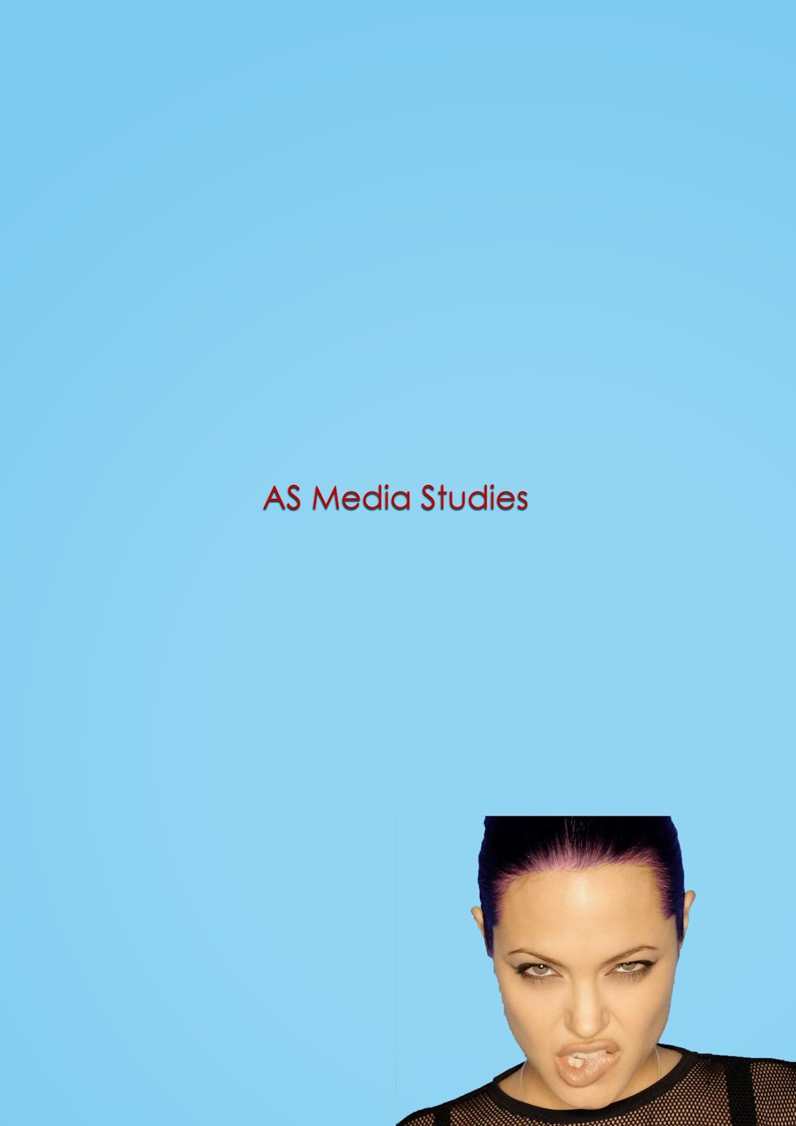
As my second image, I chose the 'Seventeen' magazine, unlike my other magazine choice. The denotations I see are, that  the main image is a medium shot of a young female, with long brown hair, who looks much younger than the other magazine, I can also see that the masthead is a bright orange colour, there is a cover line and a kicker. 

The connotation of this magazine is that the young female, is again, Miley Cyrus. Although Cyrus was very famous when this magazine was published she wasn't as famous as she is after her drastic change. Before her change she was well known for her role in 'Hannah Montana' and her movie roles in films such as 'The Last Song' and 'So Undercover'. In this picture Cyrus has her hand on her hip and is smiling, this is a very girly pose this would insinuate that the magazine is aimed at a younger audience, maybe teenage girls aged 9-14. Another reason as to why I would insinuate this magazine with young females is because of the colours, they are very bright colours such as orange, yellow and pinks.


The cover line of the magazine is ' Fashion & Beauty Ideas!' this again hint that this is aimed at young females as they are into fashion and like to know the latest things about fashion and beauty tips. Unlike the other magazine Cyrus is fully clothed.

Tuesday 9 September 2014

Indesign


This challenge was very straight forward, the first thing I did was open InDesign, I then selected the document option and when that opened I then went down to columns and changed in the three. Next I had to change the colour of the background, to do this I selected the shape tool and after covering the page in a rectangle I then went to the right side and changed the colour to the current light blue, The next stage was adding a text box, to do this I selected the text box tool on the left side on the tool bar and then made a text box to fit the across the columns at the top, I then I typed in the chosen title "Why Magazine" and then chose size 60 and changed the font to "Abadi My Condensed Light".
The image in the middle was the next step, I was fortunate enough to already have a picture I wanted to use on my desktop, so I simple dragged the image from the desk top to InDesign and made it smaller so I could fit it in the middle column, I also added another text box, but this time I added it down the left column and stretched it out to fit.
With the new text box  I added the designated text by copying and pasting what was needed, I deleted some bits so it would fit and then I was done.

Monday 8 September 2014

Photoshop Challenge


In this quick photoshop challenge, we were asked to open a A4 document in Photoshop, to do this I went onto Photoshop then I went into file; open and then new and pressed okay. The next stage was to write 'As Medie Studies' is Century Gothix in size 24 font. This was a pretty straightforward step so I selected the text tool on the left hand side bar and then I dragged it on to the document, after doing this I the typed the text, I then highlighted the text and went to the top bar and changed the font to 24. 
My next task was to change the txt colour to red and move it to the middle of the page. I highlighted the text then selected the colour box at the side bar and changed to red, I chose a dark red and then I selected the mouse tool and moved the text to the middle of the page. I had to then change the background to blue, to do this I double clicked the background later on the right hand side and then went into colour over lay and changed the colour to blue. To add the drop shadows which was the next stag, I had to double click the text layer and then I selected drop shadow. 
The final two stages were to place a picture of a person from the Internet and I chose to pick Angelina Jolie, I got a picture of her from the Internet saved then dragged my image to my back ground, I then used the magic wand to cut round the image so It had no background. After this the other step was to change their hair colour, to do this I went to image at the top of the bar then I selected adjustments and then colour balance.

Sunday 7 September 2014

Skin Tutorial


In this challenge we were asked to photo shop this girls face and make it "blemish free" to do this we started with the spot healing tool, this helped us hide the spots and shines se had on her face, but we had to be careful with where we did it and how much we did as, like you can see on her nose, it leaves a funny mark and you are able to tell she was photoshopped. Next we were asked to make her eyebrow look more like she had an eyebrow as her was very faint and small, we had to make sure we didn't make it look to obvious. To do this we went to the pain brush tool and selected the colour black on the little box at the end of the left side bar, we the. Realised we had to zoom in, to do this you can use the magnifying glass, or there's also another way to zoom, which is the way I used, this requires you to use the command key and press the button where the + sign is, to zoom out you do the same but use the - sign. After we zoomed in we had to subtly make her eyebrow look better, so we dragged the painbrush over her eyebrow and then if we make a mistake, or went over her eyebrow, then we went to the rubber tool on the left side bar and then made the rubber as big or as small as we needed by moving the bar at the top of the page when we selected the rubber. After this we realised that some things were too obvious, so we went on tools at the top of the page, then I went down to blur and selected "smart blur" after doing so a box popped up with the image in that was no smart blurred and it gave us the option of make it a higher blur or a lower blur, I went with the lower so It wasn't as obvious that I had blurred it. After doing so we then had to give her some makeup on her eye, we also went to the paintbrush and selected the colour we wanted to give her eyeshadow, but after doing this we realIsed the colour was too bold so we went to the right bar and selected the background and then made the opacity lower so it wasn't as bold. Next we saw that by changing the opacity that her hair was too dull, we got the rubber tool and "rubbed out" her hair which brought back the original colour without the opacity lowered on it.

Wednesday 3 September 2014

CD Cover Task


Above is the finished product of the album cover we were asked to create. We were given three images to use; a music sheet, a trumpet and a cd, we were also allowed to use others if we desired, but unlike others I opted against and just stuck with the three. First I uploaded the images to photo shop, I then clicked on the cd and trumpet pictures to cut around them using the magic wand to get rid of the extra back ground I did not need and then I put the music sheet on the bottom layer and placed the other two on different ones. I then decided that I want to change the look of my images so I started with the background, I play around a bit clicking on things on filter, I went on a few things such as blur and distort, but settled on going into render and selecting "lighting effects" I positioned it how I wanted and was quite happy with how it looked. I later decided that it wasn't just right, so I instead looked down to the side bar and played around with stuff on that I went to levels and moved the middle bar to the right and it made the music notes darker, I decided there was nothing else that needed doing to the background and left it as that. On both the trumpet and cd I double clicked their layers and went on blending options, on the first drop down box I went on nearly all of them to fine the right ones, I eventually stayed on "hue" and moved the opacity and full opacity down slightly till they were slightly brown and see through, I also selected the cd again and went on to filter and filter gallery, I again played around this things on there and settled on going into the sketch folder and went on to "photocopy" and made the darkness higher and I was happy with the result. Finally I moved the images around and left then where they are in the cover now.