
Saturday, 20 December 2014
Front Cover Process 8
Front Cover Process 7

Front Cover Process 6

Front Cover Process 5

Front Cover Process 4

This stage was making the black and white more bolder, to do this I selected the background layer, went onto image then adjustments and curves then played around till I liked it which got me this.
Front Cover Process 3

Front Cover Process 2

Front Cover Process 1

Friday, 19 December 2014
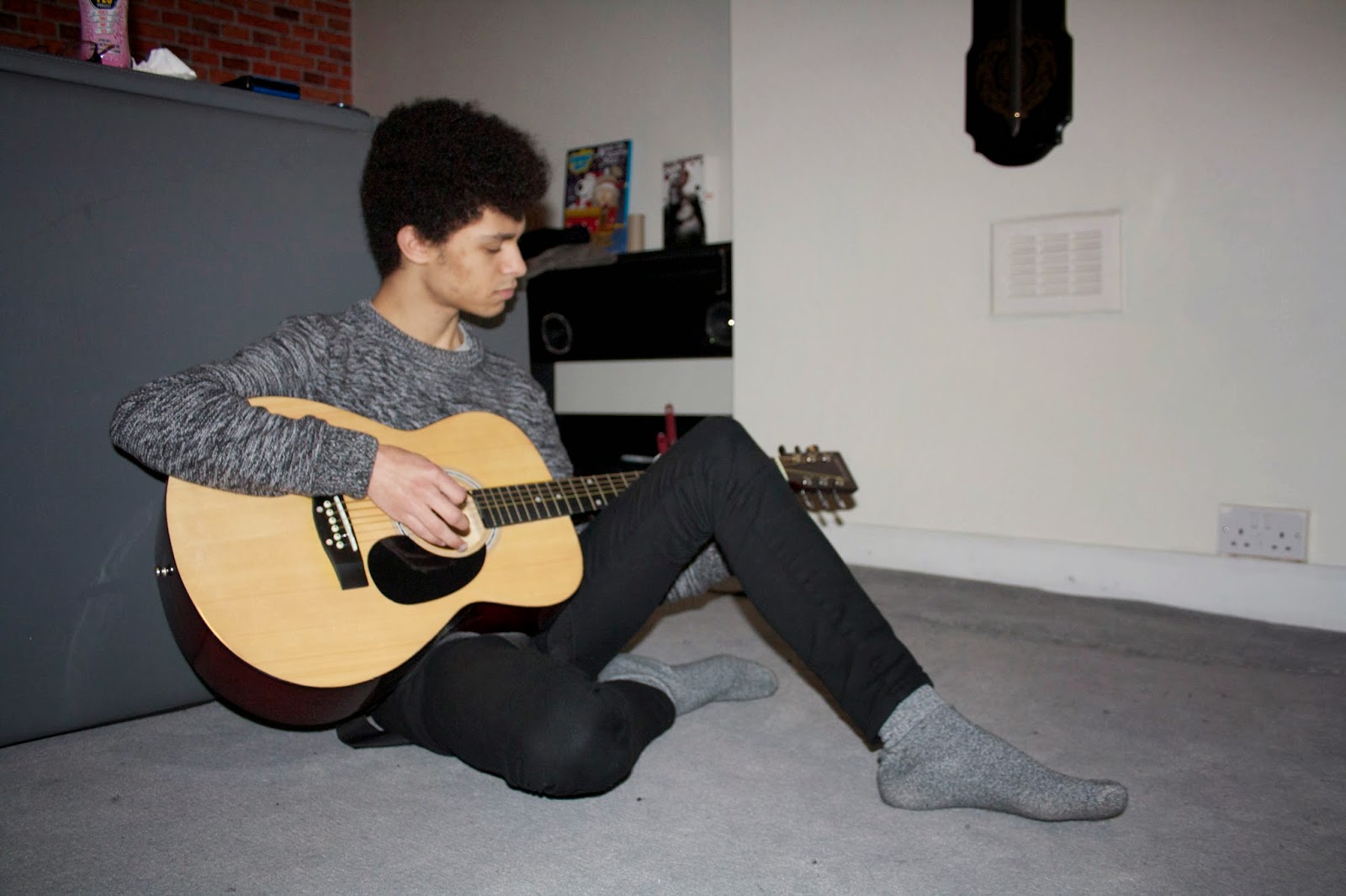
Props For The Shoot

Above is a Gif I made using gifmaker.me and in the gif you will be able to see the props and costume I used dying this shoot for my front cover.
Monday, 8 December 2014
Weekly Plan 4
This week I plan to do the interview questions for my double page spread story. Since I actually did more than planned last week such as my real shots for the front cover, along with the risk assessment, location recce, my shooting schedule and weather posts to check if I can go through with my shoot on the day planned, I plan on starting rather my front cover, or I may start editing my photos for that and coming up with what to put on my front cover.
Sunday, 7 December 2014


Friday, 5 December 2014


Tuesday, 2 December 2014
Double Page Spread Test Shots

These images again were taken on the SLR camera I will be using for the actual shoot, I was trying different thing to see which I prefer and to see which ones my model was most comfortable with. I will pick closer to the time which pose and style of the spread I will use. These test shots are also inside, although used with flash it made a darker area around the outside, but my actual shoot will be out side so the lighting will be better and it will not have to use the flash.


Costume Research

Above is a gif I created using gifmaker.me to show male fashion and how I came up with my models costume. I focused on the older side again, making it casual but not too boring, I think the leather jacket and shirt go well together for a casual cool look so I've chosen to use both of them, I think this look relates to my target audience as its an older but casual look.
Monday, 1 December 2014
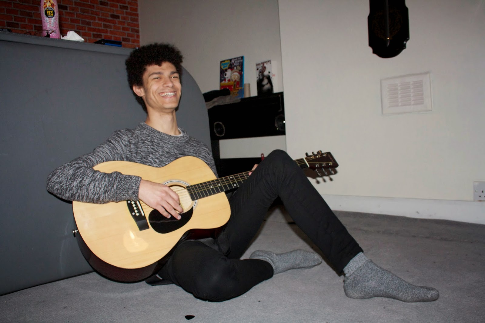
My Model Test Shots
Bellow are images I took on a SLR camera to test it out with my model and to show who my model is.

Final Masthead

After thinking for a while, i've decided to use this font for my magazine masthead, I like how its simple yet cool, but I might change it to this one depending on how the picture turns out, this font is called "Orange Juice".
The other font I might use for my masthead is the one bellow, for similar reasons as the first, but its filled and I like the "stitching" round the letters. This font it called "Fabrics".
I will add a post when i have completed the masthead, including colours.
I will add a post when i have completed the masthead, including colours.

Technology Used

Apple Mac
The apple mac is the most important tool we use, this is the base for everything, we access our blogs on here, we use photoshop on here, we access everything we need to use to create our magazines, but the camera, we can use prezi on there also.

SLR Camera
Photoshop
Photoshop is used a lot to in media, we need this like we need everything else, we need it to edit pictures we are using, to create our magazine, this is the finishing touches to what we need.
Weekly Plan 3
This is my third weekly plan, this week Im planning on getting quite a bit done, last week including what I did I also got my model release form done so I could do my shoot, I'm going to do my drawn drafts of my front cover, contents page and double page spread. I also plan to talk about the technology we use in during the time in class and out of it and why those things are important, for example the Apple Mac we use daily. Though I had ideas about my masthead and I wanted to have a final idea of what one I will use I will show the two Im stuck between and I will do some research into the costume I will use on my shoot and the final costume choice including images. I also have decided to do some test shots of what I would like my model to do in the shoot so I have a rough idea of how I can take my shots at my location.
Thursday, 27 November 2014
Contents Page Draft


Wednesday, 26 November 2014


Front Cover Page Mock Up

Above is a mock up of what I want my front cover to look like, to create this I went on to Photoshop and after creating a new page I then used the rectangle tool to create the boxes to show where I want things going and I did the same to create the colour code which is to the left. Though this is my final draft for the cover, I may not keep the headline ect on the right side.

Drawn Draft
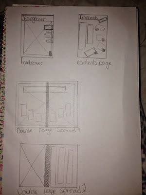
This is a draw draft of my font cover, contents page and double page spread which there are two ideas for, I will also make a draft on Photoshop for each one so it is easier to see and so you can understand which bit is which.
Tuesday, 25 November 2014


Music Magazine Front Cover Draft

 This is the mock up I created on Photoshop using the rectangle tool to make the boxes I need and the the colour tool at the top to change the colour of the lines and fill them in, to the left is the colour code so you know which box is what.
Smart Society
What is a Smart Society?
A Smart Society is the society now as is, its a society that has different ways to access the internet such as; mobile phone, a laptop, a tablet, a tv ect, we are a sharing culture who can share anything via most things, where as before the technology we had to share things with each other through letters or talking not we do it over social networks. Within the internet there is a place to store everything, from your tweets, messages, facebook videos and images, but there is "the cloud" this is a place within the internet, you don't think about it being there you just know everything on you social networks will be there unless deleted.

Millennials
Millennial
Millennials, also refereed to as "Generation Y", are a demographic cohort following "Generation X". Generation Y first appeared in 1993 and was used to describe the teenagers of the time, Generation X is the generation that was much before then it was a time between the 1960's and 1990's.
Digital Natives And Digital Immigrants
What is a Digital Native And Digital Immigrant?
A digital native is a person who grew up always knowing technology, they knew the internet, smart phones, they're generally born in 1985 and above, these are the "Generation Y". A digital immigrant on the other hand is the total opposite, these people were born before technology came, they therefore adapted to the technology when it came later on.
Monday, 24 November 2014
Fonts
There are two different types of fonts used on magazines. The first type is "Sans-Serif" this is a font generally used as the title, as it is simple to read. Examples of this are Helvetica, Avant Garde, Arial, and Geneva. Serif fonts include Times Roman, Courier, New Century Schoolbook, and Palatino.


The second type is called "Serif" this is used for the writing, it is easier to read as it has a little flick at the ends, this also helps distinguish the difference between Sans and Serif, the little flicks help the writing come together so it is a lot easier to read. Examples of fonts like this are Didot, Onyx and Times Bold.
Test Shots

Sunday, 23 November 2014
Front Cover Analysis


The three above images are all examples of types of front cover magazines, as you can see they are pretty similar and two are "Rollingstones", but I chose this to show how one brand of magazines can be different. I personally like all of these covers, I like how in the first Rollingstones magazine that its all black and white but the masthead is in colour, I think unless It doesn't work that I will probably do the image in black and white but the text and masthead in colours so they stand out. In the second magazine cover I like how its very bright, but I doubt I would use too much colour as I don't want it too bright, as it would distract the real genre of music, bright colours are more for a kids pop magazine but as mine is for an older pop audience then i wouldn't want it too bright or the audience will be lost at who it is aimed at. The last one, though being another Rollingstones, is totally different to the other one, this one is brighter, this one uses a long shot whereas the other uses a close up, I think depending on you aim for the magazine the shot type makes a big difference, the close up and black and white together in the first gives of a feeling that this is for the lay back, indie kids, whereas the one in colour give you the, this is aimed at pop fans.
Though the first one is not for me, i personally like how theres a lot of text on the side, but you know just by looking that the text is pretty irrelevant, theres too much and its too little for you to read it all, you just have a quick glance to see who and what is going to be inside of the magazine, I like how its not sentences or bullet point but its just written straight after it all.
The colours are a main statement for your magazine, if its bright, its a kiddy pop, its its dull and lay back, its indie, if its just slightly lay back but its got colour on it then its an older pop. Rollingstones is known and recognised for their masthead, I think the masthead is the most important with the main image, your magazines masthead should be repetitive, it should be the same style and maybe the same colour, different colours if its a special addition.
The text down the side should not be too big, your eyes should stay in the image, use some photography skills to keep their eyes in the picture, such as triangles and leading lines, this and the small or not so noticeable selling, head and cover line will keep your eye on the image so you notice it, the masthead needs to be the boldest thing on the page or you will lose it, if you cant see it or notice it, your buyers will not know whats its called, or care.
Saturday, 22 November 2014
Contents Page Analysis


Above are three different images of contents pages, all three are very different in their style, colours and fonts. This is unlike with my double page spread analysis, as they were very similar. But similar to the double page spread there is a recurrence of the colour red, in all three, even the none colour one in the middle red is involved. The first contents page give me the feeling it is a magazine aimed at a younger audience such as 13 year olds or around that age, I believe this because the writing is very big and bold, the colours are bright and the image is of Katy Perry and she looks very girly, all of theses factors make me think that the magazine is aimed at a younger audience.
In the second contents page I believe this is aimed at a slightly older audience this is because the colours are not as bright as they are in the first contents page. I also believe that it is for an older audience as the band featured on it is The Rolling Stones, which is a older band from the 1970's to the 1990's so they're audience would be on the older end of fans or the ages around 17-20, this is also because the layout and colours and the artists in the picture are very lay back.
In the last image I believe this is also aimed at a slightly older audience but not the same audience as the first, which would be a pop audience or the second which I believe to be aimed at a indie styled audience, the last is a pop but not the same type of pop as the first, I believe its aimed at a slighter soul based pop audience.
In my personal opinion I like the first the most but the second I could use as ideas for my magazine as it would see to fit in with it more, although the first is a nice simple it catches your eye with the bright colours and bold fonts, I like that about it but in the second I think it is also simple yet effective, it fits the purpose, its very lay back and calm, but it gives you information as unlike in the first one which gives you information but its very image based, the image is taking over so you just don't get to notice the information at the side its pushed away and hidden but in the second the page is split down the left side so you get the clear sight of the information especially as it is in a different colour than the image background unlike the first image where it is all white.
I'm not too keen on the too much information, I prefer the big image little, but enough information, I think its too much writing, you don't want to give it all away, you want to give them enough to keep them interested but not everything you want them to open the first and carry on not know what inside in full.
Subscribe to:
Posts (Atom)